The Importance Of Mobile Web Design
The Importance Of Mobile Web Design

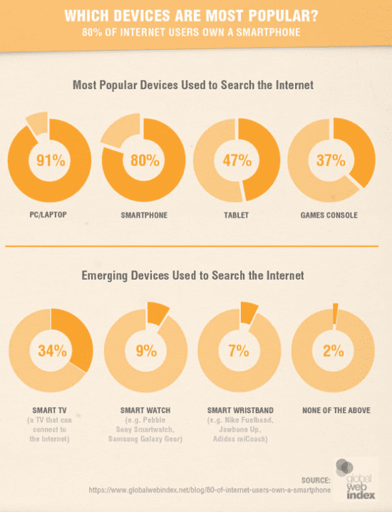
Did you know that over 80% of internet users own a smartphone? And over 47% of users own a tablet device? With such a large amount of users now using mobile devices to access the internet it’s vital you understand the importance of mobile web design.
The rise in mobile web design and mobile websites has only recently happened in the past few years. The original iPhone was released back in 2007, only 8 years ago and was a huge hit. Before that mobile websites were pretty much none existent and if a business did have one it would be very simple and basic.
Ever since the smartphone boom more and more mobile devices have been released only increasing the number of mobile users. The first iPad was released in 2010 and since then a whole range of competitors and new models have been launched on the market. With iPads having a much larger screen than any smartphone it allowed users to browser websites easier. Since you can’t make phone calls on iPads out of the box, most people bought iPads for the primary purpose of mobile web browsing. As businesses soon realised this suddenly mobile web design and having a mobile optimised website was in high demand.
How Does Mobile Web Design Help My Conversions?

Traditionally conversion rates have always been higher on traditional desktop computers as users feel safer buying products on their home computer in the comfort of their own home. It’s only recently that there has been an increase in the conversions rates on tablet and smartphones.
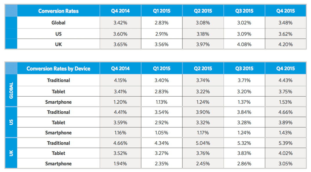
There is data showing the conversion rate of smartphones and tablets versus traditional desktop PCs. The data shows that global conversion rates have increased on all devices from 2014. Traditional desktop computers had a conversion rate of 4.43% which is the highest on the list compared to the other devices. Tablets devices came in 2nd place with a conversion rate of 3.75%, less than a 1% difference from traditional desktop computers. In last place was smartphones with a 1.53% conversion rate.
Although no single mobile device currently has a higher conversion than the traditional desktop, smartphones and tablets conversion rates combined are higher than traditional computers. Combined the conversion rates come in at 5.28% versus the 4.43% of traditional conversions. This shows that mobile users make up a large number of conversions and easily rival the standard device, the desktop computer. If your website isn’t mobile friendly then you could be losing out on a large amount of sales.
From looking at the rate of growth of mobile conversions over the last year it’s clear they’re growing at a steady rate. At the rate it’s growing it won’t be long until mobile conversions become the norm. With new mobile devices being released every year with new technology making them faster and more powerful websites will only become more accessible in the future.
The Difference Between Desktop and Mobile Websites

Desktop websites are normally designed with the user’s experience in mind and can contain a lot of media such as videos and pictures. These will load no problem on desktop computers and will be easily viewable.
The problem with mobile devices are depending on the ages and operating system them don’t always support all media formats. This can greatly reduce the user experience especially if they don’t load and stop the website from functioning correctly. When it comes to mobile websites the design needs to fit the size of the screen so it is easily viewable. Failure to do this will leave the visitor having trouble navigating the website.
The best way to solve this problem is to make sure you have a responsive website. A responsive website responds to the device it is being used on. If the website is being viewed on a mobile device like a tablet or smartphone then the website will resize to fit the size of the screen. Responsive websites also work great on desktop computers as many people use different sized monitors with different resolutions. Websites that aren’t response normally have a certain device or resolution that they are suited for and everything else will look terrible.
As you can see having a mobile friendly website is essential if you are looking to retain your visitors and tap into the millions of potential leads from mobile users.
If you need help with a custom responsive website for your business that is tailor made to fit your every need, then contact us below for a free consultation on how we can help.


